Somebody once told me that paint is paint, and that it didn't much matter what you use for miniature painting. Turns out they were wrong. I've been painting with Contrast paints for the past few weeks, and I don't think I want to paint with anything else ever again (forgive the hyperbole).
Contrast paint is the trademarked term for a line of miniature paints by Citadel. They're designed with particles of varying density, such that darker shades fall into the recesses of a model, and lighter shades settle on the surface. This results in an automatic shading effect, plus an all-round rich texture.
I have no particular allegiance to the Citadel brand, aside from the fact that it's the miniature paint I have the most experience with, and it's the brand that's easy for me to find in New Zealand. I do know that following the development of the Contrast line, other companies have come out with the same concept. The Army Painter's Speedpaint line is supposed to be similar to Contrast, but I can't vouch for the results because at the time of this writing, I haven't tried them.
Not quite love at first sight
What I have experienced with Contrast paints so far has taken me entirely by surprise. Not knowing the difference between Contrast paint and any other paint, I recently went to my local Warhammer store and asked for "an electric blue" paint. I had some magical items on some miniatures, and I wanted to paint them with something special. The guy in the store handed me Pylar Glacier, which looked pretty brilliant in the pot. He showed me a miniature that had been painted with some of it, and it looked suitably vibrant.
I bought it, and eagerly went home to try it out. I used it to paint the orb at the top of a staff, and failed miserably. No matter what I did, I just couldn't seem to get the blue onto the orb. I'd dip the brush into the blue paint, but once the brush touched the orb it almost seemed to have turned into clear paint. It wasn't at all vibrant like the pot of paint, and it wasn't nearly as thick as the other paints I had. If anything, it seemed more like a wash than a paint.
I spent several days believing that I'd wasted my money and that I'd never have any use for Pylar Glacier. I still didn't understand, at this point, that I'd acquired a special kind of paint called Contrast, or what that meant. All I knew was that I'd gone out looking for a specific paint, and had apparently failed. If I couldn't even make a purchase right, what hope did I have to become a better painter?
Making sense of it all
A few weeks later, I got tired of mixing Mephiston Red and White Scar to create fleshtones. I realised there had to be a fleshtone paint in the Citadel line. After all, these paints were specifically designed to paint little toy soldiers from a galactic Imperium consisting entirely of humans. So I went back to the Warhammer store and asked for flesh tone. The guy handed me Guilliman Flesh. It's right there in the name. It seemed a little darker than I'd expected at first, but I deliberately paint soldiers of varying ethnicities, so I didn't mind that soldiers painted with this fleshtone would be browner than pink.
I went home, painted a face with Guilliman Flesh, experienced the same level of confusion at the consistency of the paint but loved the end result. With one dab of paint, I got a face with a beautiful tan, with darker shades providing quick detail work. And that was something I got instantly, or at least in the few minutes it took to dry. I'd never seen anything like it.
Still not understanding what I was using, I tried Guilliman Flesh on a leathery Otyugh from D&D and, honestly, I've never seen such a beautiful trash monster. Every nuance of the (not particularly complex) model was accentuated, and the monster's flesh ended up with a vaguely watercolour texture.
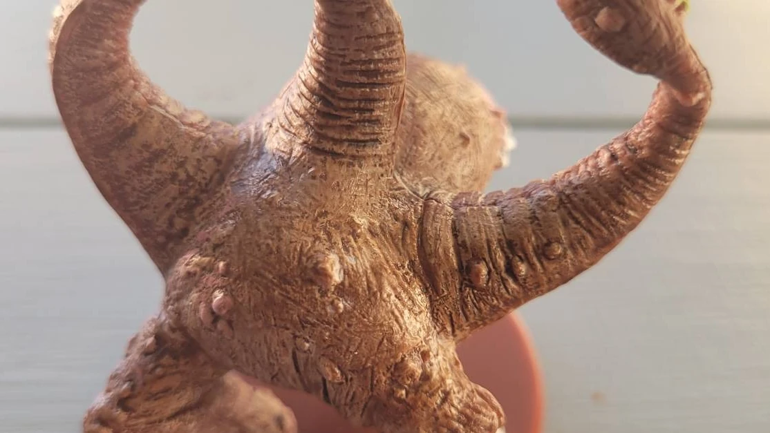
Since then, I've used Pylar Glacier as D&D orc skin, I've used Guilliman Flesh for fur and flesh and leather, I've used Ork Flesh for a D&D beholder and cloth. And it all looks amazing.
Trying Contrast
Contrast paints take a little getting used to, if you're used to "normal" paint. I think of them as watercolour, partly because of their consistency and partly because of how they look after drying. Knowing nothing about paint, I don't actually know if this is a fair comparison. In short, though, Contrast paints can move a little differently than normal paint (depending on how much you water your normal paint down), and they definitely dry differently.
If you try a Contrast paint, try it over a white or gray undercoat, and try it initially on a fairly broad or, conversely, a small but confined area of your model. In other words, don't use it on the tiny details first. Use it either in a region that gives you a lot of room to move around on (like a cape or the flank of a large animal), or else use it on a part of a model that's got ridges and crevices to control the flow of the paint for you.
Contrast paint for life
In my opinion, Contrast paint undersells itself. A lot of the benefits you hear about Contrast from Citadel is based on speed. You do shading and highlighting all in one step, so effectively you're painting faster. But for me, I'm not only painting faster, I'm getting results I don't know how to get otherwise. I understand the concepts of shading and highlighting, and I do give them a try sometimes, but usually I just settle for the flat look. I like the look of a flat paint job, but for the same effort, with Contrast, I get a model that's shaded, highlighted, and in many cases textured with nuance I cannot personally imitate with normal paint.
Arguably, I'm robbing myself of important painting lessons, here. By relying on Contrast to do subtle painting tricks, I'll never actually learn how to do those myself. Manually. Like in the good old days.
The thing is, I don't want to learn paint technique. I enjoy painting, but I'm not a painter. I just like colouring in toy soldiers. I'm more than happy to use whatever physical technology to help me get better results than the day before. I don't want to make it a career, I just want to be happy with the results. Contrast paints make me look like I know what I'm doing, and the results make my models look great.
T'au soldiers photo by Seth Kenlon.